Discover great_tables: The Python Answer to R's {gt} Package for Table Formatting in Quarto and PyShiny


Crafting compelling narratives often depends on presenting insights clearly and effectively. This skill is key for data science. For users of R's {gt} package, it has provided a powerful and flexible way to create publication-quality tables in Quarto reports or Shiny apps such as clinical trial reports, research documents, and business analytics reports.
However, Python users are searching for a similar tool. This search has led to the rise of great_tables —a promising library designed to bridge this gap and enhance table formatting in Quarto and PyShiny.
Discover how to craft professional-grade clinical tables in R. Follow our guide to get started with {gt} package.
In this blog post, you'll explore the capabilities of great_tables and see how it helps Python users improve their data presentations.
Why great_tables?
Data Scientists can toggle between R and Python, leveraging each language's strengths in their data analysis workflows. The challenge has been the absence of a gt equivalent in Python, especially noted in Shiny applications where well-formatted tables are essential.
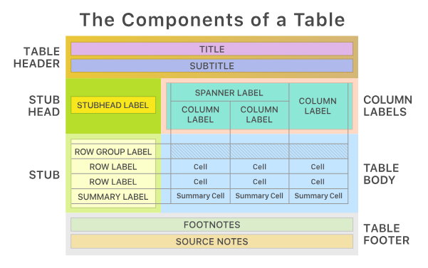
Table formatting with great_tables starts with your data typically in a Pandas or Polars DataFrame after which you can design your table by selecting the specific elements and styling options that best fit your project’s requirements.
great_tables mirrors the {gt} package's ability to accurately format tables, making it a go-to for Python enthusiasts seeking to enhance their data presentations. It’s not a coincidence as they both come from Posit!
Whether you're preparing a Quarto report or developing a PyShiny application, great_tables ensures your tables are informative and visually appealing. You can render your table directly in the console, embed it in a Jupyter notebook.
Key benefits of great_tables:
- Provides a familiar experience for gt users transitioning to Python.
- Enables intricate table customization and styling.
- Integrates seamlessly with Quarto and Pyshiny and potentially with Streamlit.
- Easy-to-use syntax mirroring gt.
- Extensive customization for table appearance.
- Seamless integration with Python data science tools.
Explore innovative ways to supercharge your Shiny for Python apps – learn how to leverage custom components in this comprehensive guide.
Getting Started with great_tables
Let’s build an application that displays stock market data (specifically, the S&P 500 index) in a table format.
Importing Libraries and Setting Up Data
from datetime import date
import great_tables as gt
from great_tables.data import sp500
from shiny import App, ui, render, reactive
import pandas as pd
Determining Date Range for the Data
This will compute the minimum and maximum dates available in the sp500 dataset and then set a default date range (START_DATE to END_DATE) for the table display.
# Dates are in format "2020-12-31"
TOTAL_MIN_DATE = date(*(int(e) for e in sp500["date"].min().split("-")))
TOTAL_MAX_DATE = date(*(int(e) for e in sp500["date"].max().split("-")))
START_DATE = date(2014, 6, 7)
END_DATE = date(2014, 6, 14)
Creating the User Interface
app_ui = ui.page_fluid(
    ui.panel_title("Great Shiny Tables"),
    ui.layout_sidebar(
        ui.sidebar(
            ui.p(
                ui.markdown(
                    "This is pyshiny demo of `great_tables` library. "
                    "It's like `{gt}` in R, but in python."
                ),
                ui.br(),
                "Works flawlessly with python. ^^",
            ),
            ui.input_date_range(
                "date_range",
                "Pick date range",
                min=TOTAL_MIN_DATE,
                max=TOTAL_MAX_DATE,
                start=START_DATE,
                end=END_DATE,
            ),
            ui.p(
                ui.markdown(
                    "Check out the `great_tables` [documentation](https://github.com/posit-dev/great-tables)."
                ),
            ),
            width=400,
        ),
        ui.output_ui("gt_sp500_table"),
    ),
)
Defining Helper Functions for Date Handling
Convert a date object into a string in YYYY-MM-DD format, which is necessary for filtering the dataset.
def date_to_str(d: date) -> str:
    return f"{d.year}-{d.month:02d}-{d.day:02d}"
Setting Up Server Logic
def server(input, output, session):
Reactive Data Filtering Based on User Input
Include functions to update the data displayed in the table based on the date range the user selects.
@reactive.calc
    def input_date_range_str() -> tuple[str, str]:
        min_date, max_date = input.date_range()
        min_date_str = date_to_str(min_date)
        max_date_str = date_to_str(max_date)
        return min_date_str, max_date_str

    @reactive.calc
    def filtered_sp500() -> pd.DataFrame:
        min_date_str, max_date_str = input_date_range_str()
        sp500_filtered = sp500[
            (sp500["date"] >= min_date_str) & (sp500["date"] <= max_date_str)
        ]
        return sp500_filtered
Rendering the Table
Finally, use great_tables to format and display the S&P 500 data in a table within the web application.
@render.ui
    def gt_sp500_table():
        min_date_str, max_date_str = input_date_range_str()
        df = filtered_sp500()
        table = (
            gt.GT(data=df)
            .tab_header(title="S&P 500", subtitle=f"{min_date_str} to {max_date_str}")
            .fmt_currency(columns=["open", "high", "low", "close"])
            .fmt_date(columns="date", date_style="wd_m_day_year")
            .fmt_number(columns="volume", compact=True)
            .cols_hide(columns="adj_close")
        )
        return table


app = App(app_ui, server)

Here’s the entire code:
from datetime import date

import great_tables as gt
from great_tables.data import sp500
from shiny import App, ui, render, reactive
import pandas as pd


# sp500 table has dates as strings in 1970-05-20 format
TOTAL_MIN_DATE = date(*(int(e) for e in sp500["date"].min().split("-")))
TOTAL_MAX_DATE = date(*(int(e) for e in sp500["date"].max().split("-")))

START_DATE = date(2014, 6, 7)
END_DATE = date(2014, 6, 14)


app_ui = ui.page_fluid(
    ui.panel_title("Great Shiny Tables"),
    ui.layout_sidebar(
        ui.sidebar(
            ui.p(
                ui.markdown(
                    "This is pyshiny demo of `great_tables` library. "
                    "It's like `{gt}` in R, but in python."
                ),
                ui.br(),
                "Works flawlessly with python. ^^",
            ),
            ui.input_date_range(
                "date_range",
                "Pick date range",
                min=TOTAL_MIN_DATE,
                max=TOTAL_MAX_DATE,
                start=START_DATE,
                end=END_DATE,
            ),
            ui.p(
                ui.markdown(
                    "Check out the `great_tables` [documentation](https://github.com/posit-dev/great-tables)."
                ),
            ),
            width=400,
        ),
        ui.output_ui("gt_sp500_table"),
    ),
)


def date_to_str(d: date) -> str:
    return f"{d.year}-{d.month:02d}-{d.day:02d}"


def server(input, output, session):
    @reactive.calc
    def input_date_range_str() -> tuple[str, str]:
        min_date, max_date = input.date_range()
        min_date_str = date_to_str(min_date)
        max_date_str = date_to_str(max_date)
        return min_date_str, max_date_str

    @reactive.calc
    def filtered_sp500() -> pd.DataFrame:
        min_date_str, max_date_str = input_date_range_str()
        sp500_filtered = sp500[
            (sp500["date"] >= min_date_str) & (sp500["date"] <= max_date_str)
        ]
        return sp500_filtered

    @render.ui
    def gt_sp500_table():
        min_date_str, max_date_str = input_date_range_str()
        df = filtered_sp500()
        table = (
            gt.GT(data=df)
            .tab_header(title="S&P 500", subtitle=f"{min_date_str} to {max_date_str}")
            .fmt_currency(columns=["open", "high", "low", "close"])
            .fmt_date(columns="date", date_style="wd_m_day_year")
            .fmt_number(columns="volume", compact=True)
            .cols_hide(columns="adj_close")
        )
        return table


app = App(app_ui, server)
Make informed decisions for your data projects! Explore the strengths of Streamlit and Shiny for your next dashboard.
Summing Up Python’s great_tables
For data scientists and analysts who rely on Python and have experience with R's gt package, great_tables offers a familiar and powerful toolset for creating detailed and customized tables. Its integration with Quarto and Pyshiny ensures a seamless transition and consistent experience across both languages.
Explore great_tables and enhance your data presentations in Python with the finesse and precision that gt users have long enjoyed in R.
Ready to innovate in clinical research? Explore how Shiny and Quarto are reshaping interactive reports.
Contact us!